
Alpha Air
Mobile Booking Experience
Overview
Time
1 Week
My Role
UX/UI Designer
Tool
Sketch (Visual Design)
Adobe XD
Adobe Photoshop CC
Adobe Illustrator CC
Pen and paper (Mock Up)
Brief
I travel quite frequently and use a range of apps to enquire. When it comes to actually booking the flight I always tend to stick to the websites platform as I find it more user friendly. As a designer I wanted to work on a personal project to see if I could design a mobile booking app that would be user friendly but aesthetically pleasing. I created Alpha Air as I wanted to use the skills I have learnt so far to design a prototype but also do testing and usability during the design process.
Research & Design
User Pain Points
Complex
Price Comparisons
Duplicate purchasing
Booking through apps does seem daunting and complex at times. Even being tech savvy I find booking over the phone or web platform feels more simple and saves a lot of time.
When searching for flights I don't always fly economy. Trying to find the business and 1st class options can be challenging as you have to research or add them in to your search criteria.
Also most of the apps don't do a price comparison section for the different classes of seats.
The flights I did book with an app charged me twice and took 3-5 working days to issue the refund. On the payment page, it took quite some time to place the order so I had to refresh the page and this resulted in a duplicate purchase.
Mood Board
Initial Sketch
With the pain points and mood board, it has given me a few ideas and features I would like to showcase on the app.

From Loading page to register details page

From Home page to Inbound search page

Final Sketch

From Wallet page to Booking Confirmation page

I showed my sketches to a few users who liked the concept and found it user friendly. They gave positive feedback on each stage of the design process which is why I proceeded to final sketches.
Wireframes / Task Flows
Once I got my final sketches completed I wanted to build wireframes with task flows just to see where each button would lead. By doing this it would create an experience for the user and reveal break downs in the journey.

From Loading page to Register details page

From Home page to Inbound search page

From Wallet page to Booking Confirmation page

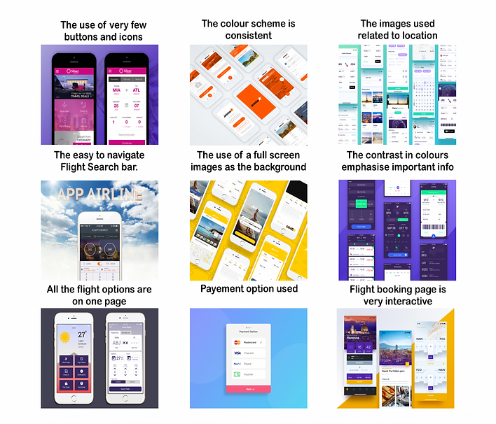
Final Design
Once the wireframes and task flows were completed, ensuring no breakdown in the customer journey, I was ready to work on the final design.

Usability Test
User Testing
Goal And Methodology
User Testing Tasks
With regards to user testing, I know my colleagues travel a lot and book through websites and apps so getting their feedback would be a good step.
Goal: To have the user navigate through the booking process seamlessly and to have all options of seat classes available to select. Also to prevent duplication of payment.
Methodology: The usability test consisted of eight users being set a written task to be followed.
Task 1: Navigate the customer journey ensuring the process is seamless from page to page.
Task 2: Look at areas of the customer journey that could be improved.
Results
When reviewing the feedback from the user testing the first issue that they all experienced was not being offered individual airports for each country. A possible solution for that would be to create a drop down menu with all the different options.
Another commonality was the confusion experienced between the inbound and outbound flight page. This was because the pages are identical in design. A possible solution discussed with the users would be to change the background location image on the return flight page.
Another issue that was mentioned was to do with the confirmation page (last page), the users would prefer to see all the details of their booking on this page instead of the congratulations message. A possible solution would be to either remove the congratulations message or amend it to include booking confirmation. This would prevent duplicate payments as will be able to see all details on screen.
On the outbound page, the users mentioned not being able to see the different airlines and compare costs. Currently, in order to see the prices you have to change the times of the flights. A possible solution to this would be to display results from all airlines within the same time period, for example all morning flights with the options of different flight classes.
Conclusion
Key Learning
Key: There is still a lot I need to work on in regards to this personal project. On reflection, it would have been better to do more research initially on competitor review and the different search bar options available. More competitor analysis would have enabled me to have a better understanding of what users require when searching for flights.
It would also be good to see how other airline companies display their booking confirmations when a payment is made to help understand what information the user requires.
Next Steps
1. Back to research stage and incorporating a user journey and competitive review will be a great start.
2. Look into incorporating a search bar menu on the home page.
3. Change the return page to avoid confusion from the inbound page.
4. Add confirmation details instead of a congratulations message or merge both
5. To do further testing on the final prototype and use the feedback to help improve the UX/UI of the booking.

